Seasonal Color Analysis

Find out which colors are made for your skin tone

Upload your selfie

Drag & drop an image here

or

Upload a selfie. In 60 seconds, ToneMatch identifies your color season, gives you a personalized palette, and shows you which celebrities share your exact skin tone.
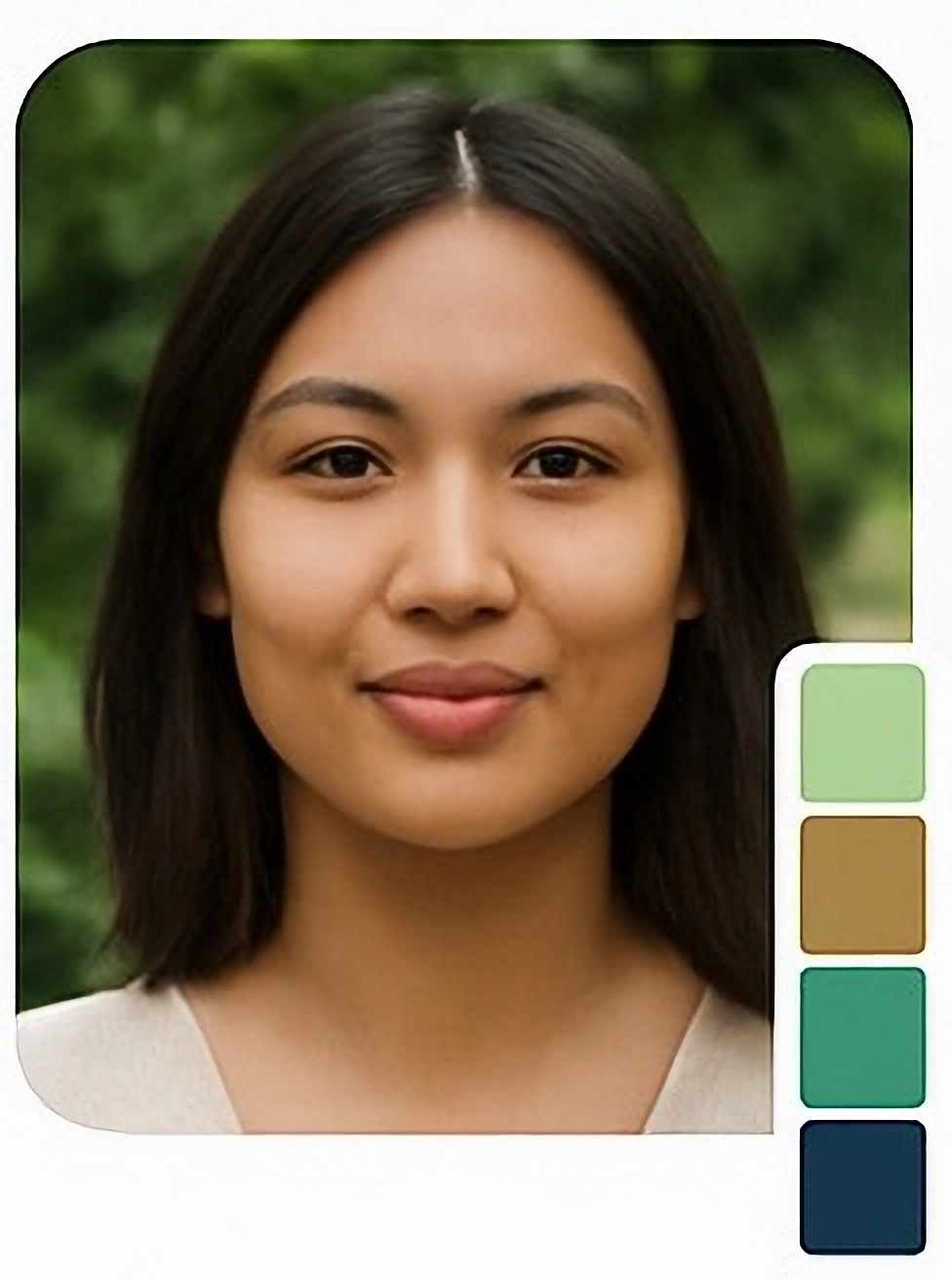
Example preview of your uploaded image

Uploaded Image

Preview of your uploaded image
Perfect Match
Summer Season Detected
84k+ Skin tones analyzed
40+ Countries
60 sec To full results
$0 To get started
See who’s wearing your palette

Discover your Celebrity Color Twin

When you know Deepika Padukone is Soft Autumn, her wardrobe stops being aspirational and becomes a reference manual. ToneMatch matches you to celebrities who share your verified skin tone profile — the same measured undertone, depth, and chroma — not just a vibe.

Find my celebrity match Included in Pro · $2.99 one-time
Soft Autumn
Deepika Padukone
Warm terracottas, rich olives, camel — her archive is a styling guide
True Autumn
Beyoncé
Rich golden tones, rust, amber — the full warm spectrum
Soft Summer
Jennifer Aniston
Muted rose, dusty blue, soft taupe — effortlessly understated
Bright Winter
Zendaya
High contrast, vivid jewel tones — colors that look electric
Light Spring
Taylor Swift
Clear warm yellows, coral, light peach — energy without weight
Soft Autumn
Priyanka Chopra
Earthy warms, muted spice tones — quietly commanding
How it works

Stylist-grade analysis. 60 seconds.

No appointment. No quiz. No guessing what your undertone might be. ToneMatch reads your actual skin and gives you something concrete to take into your wardrobe.

01
Upload a selfie

Clear face, natural light, no filter. We’ll tell you instantly if the lighting isn’t good enough for an accurate read — before wasting your time on a bad result.

02
We scan your skin tone

ToneMatch samples your forehead, cheeks, and jawline using CIE LAB color measurement — the same science behind professional dye labs and cosmetics. Not a quiz. Not a guess. A measurement.

03
Confirm your result

We show your season as a probability range, not a single verdict. If something looks off, adjust your undertone reading and the palette updates instantly.

04
Get your color card

Your season, 8 flattering colors with hex codes, 4 colors to avoid with reasons, and 3 complete outfit combinations. Download it. Take it shopping.

Why it matters

Color advice that was built for your skin

“Most color analysis tools were built for someone else’s complexion. If you have warm, medium, or deep skin — the results have probably felt approximate at best.”

Color analysis tools — quizzes, seasonal charts, celebrity lists — were built from references that skew fair, cool, and Western. ToneMatch was calibrated specifically for the complexions where that gap is widest.

Measured, not guessed

A quiz asks what you think your undertone is. ToneMatch measures the actual LAB color values of your skin pixels under calibrated white balance. One is an opinion. The other is data.

Inclusive by design, not by marketing

Our engine was tuned for warm, olive, medium, and deep skin tones — South Asian, Southeast Asian, Middle Eastern, Latina, mixed heritage — as the primary design brief, not an afterthought.

Outfit combinations, not just swatches

A palette of 25 colors is interesting. Three complete outfit combinations using your palette is something you can use tomorrow morning. Top, bottom, accessory — contrast-scored and ready to wear.

Your actual results

Here’s exactly what you’ll receive

This is a real example of your color card — your season, colors to wear, colors to avoid, and three complete outfits. Switch seasons to see different results.

Soft Autumn
Warm · Muted · Medium–Deep
Soft Autumn
68%
True Autumn
21%
Dark Autumn
8%
Colors to wear
Warm Camel
Mirrors your warm undertone without competing
#8B6F47
Muted Olive
Earthy depth that grounds your complexion
#6B7A45
Burnt Sienna
Rich warm red that amplifies your glow
#B05A2A
Warm Mustard
Golden warmth that flatters medium-deep skin
#C4923A
Deep Teal
Cool contrast that makes warm skin pop
#3D5A52
Chocolate Brown
Neutral anchor for any warm-toned outfit
#7A5C3A
Terracotta
The quintessential Soft Autumn statement
#A3785A
Warm Sand
Soft neutral that never washes you out
#B8A882
Colors to avoid
Dusty Lavender
Cool purple undertone clashes with your warm skin
Icy White
Cool clarity washes out warm, muted skin tones
Hot Pink
Too bright and cool — fights your muted warmth
Royal Blue
Cool, vivid blue creates unflattering contrast
Outfit combinations
Everyday
Warm sand top · Olive trousers · Sienna bag
Office
Sienna blouse · Brown trousers · Mustard scarf
Evening
Terracotta top · Deep teal skirt · Camel heels
Soft Summer
Cool · Muted · Light–Medium
Soft Summer
72%
True Summer
18%
Light Summer
7%
Colors to wear
Dusty Rose
Muted pink that softly enhances cool skin
#C4A0B5
Soft Steel Blue
Cool blue in harmony with your undertone
#8EAFC4
Sage Green
Muted cool green that never overwhelms
#B8C9C0
Periwinkle
Soft lavender-blue — effortlessly cool
#9EA8C0
Warm Mauve
Quiet neutrality with a cool lean
#C4BCBA
Muted Teal
Cool depth without the harshness
#8A9E95
Blush Beige
Warm-cool neutral that anchors soft palettes
#D4C5C0
Slate Blue
Medium cool blue — your strongest neutral
#6A8A9A
Colors to avoid
Warm Mustard
Warm yellow undertone fights cool skin
Vivid Orange-Red
Too warm, too loud — clashes with soft cool
Pure Black
Too harsh — soft complexions need softened contrast
Warm Peach
Warm-toned peach muddies cool undertones
Outfit combinations
Everyday
Blush beige top · Steel blue trousers · Rose bag
Office
Soft blue blouse · Slate trousers · Sage scarf
Evening
Dusty rose top · Periwinkle skirt · Teal heels
Bright Winter
Cool · Clear · Medium–Deep
Bright Winter
61%
True Winter
27%
Dark Winter
9%
Colors to wear
Deep Navy
High contrast cool — your strongest neutral
#1B2A5E
True Red
Vivid cool red that looks electric on you
#C41E3A
Deep Plum
Rich cool purple — striking and sophisticated
#5B2068
Icy Turquoise
Bright cool blue-green with vivid clarity
#00B4D8
Near Black
Maximum contrast anchor — essential for you
#1A1A2E
Pure White
Crisp cool white — high-contrast at its best
#EDF2F4
Icy Pink
Cool bright pink that pops on high-contrast skin
#E88DB4
Emerald Green
Jewel-toned cool green — vivid and alive
#2A7D4F
Colors to avoid
Warm Mustard
Warm yellow muddles cool, high-contrast skin
Camel / Tan
Warm beige drains the contrast that defines you
Dusty Blush
Muted tones quiet your natural vividity
Terracotta
Warm earthy orange — opposite of your season
Outfit combinations
Everyday
White top · Navy trousers · Red bag
Office
Plum blouse · Dark trousers · Icy pink scarf
Evening
Red top · Black skirt · Turquoise earrings
Light Spring
Warm · Clear · Light
Light Spring
74%
True Spring
17%
Light Summer
6%
Colors to wear
Warm Peach
Delicate warmth that lights up your complexion
#F9C784
Warm Coral
Clear warm color that gives you energy
#F4855A
Clear Spring Green
Fresh warm green — bright without weight
#8FC87A
Warm Yellow
Sunny warmth that radiate your natural glow
#FFB347
Light Aqua
Clear cool-warm blue for soft contrast
#A8D8EA
Ivory Peach
Softest warm neutral — never washes you out
#F7C5A0
Golden Caramel
Warm mid-tone that grounds spring outfits
#E8A86B
Warm Blush
Warm pink — your most flattering neutral
#FFB3A7
Colors to avoid
Pure Black
Too harsh — drains delicate light complexions
Muted Sage
Dusty cool tones quiet your warm clarity
Cool Periwinkle
Cool blue-grey pulls warmth from your skin
Deep Plum
Too dark and cool — overwhelms light spring skin
Outfit combinations
Everyday
Blush top · Peach trousers · Green bag
Office
Ivory peach top · Aqua trousers · Gold belt
Evening
Coral top · Caramel skirt · Warm yellow bag
Get my actual results — free

No account · Your photo never leaves your device

Free — no account needed

Your personal color card

Everything you need to know your season and start using it. No credit card. No account. No download.

Season
Color season with confidence score

Not just “you’re Soft Autumn.” We show how strongly your skin reads as each season — so you understand the result instead of accepting it on faith.

Palette
8 colors that genuinely flatter you

Named. Hex codes. One line explaining why each works for your specific undertone and depth. Not the generic season list — yours.

Avoid
4 colors to avoid — with reasons

The part other tools skip. Knowing what drains you is often more useful than knowing what flatters you. We tell you why, not just what.

Outfits
3 complete outfit combinations

Top + bottom + accessory, using your palette. Contrast-scored. Something concrete to wear, not just a reference chart.

Download
Downloadable color card

Your season, swatches, hex codes, avoid list — one page. Save it to your camera roll. Send it to a friend. Open it at the store.

Simple pricing

Start free. Go deeper for $2.99.

Free forever
$0

No card. No account. No time limit.

  • CIE LAB skin tone analysis
  • Color season with confidence %
  • 8 flattering colors with hex codes
  • 4 colors to avoid with reasons
  • 3 outfit combinations
  • Downloadable color card (PDF)
  • Photo never stored or uploaded
Start free

No credit card required

Color seasons explained

Four seasons. Twelve sub-seasons. One is yours.

🌸
Spring
Warm Clear Light–Medium

Your colors have energy. Clear warm yellows, coral, peach, warm greens. Muted or dusty tones quiet you. You don’t need them.

🌿
Summer
Cool Soft Light–Medium

Your colors are quiet. Dusty rose, lavender, soft blue, muted teal. Bright or warm tones read harsh against you. You wear the tones other seasons can’t.

🍂
Autumn
Warm Muted Medium–Deep

Your colors are rich. Olive, rust, camel, mustard, deep teal. You can carry warmth and depth that swallows other complexions. On you it looks grounded.

❄️
Winter
Cool Clear Medium–Deep

You wear contrast. Navy, pure white, deep plum, icy pink, black. Muddy or dusty colors flatten your coloring. You need clarity, not softness.

Privacy

Your photo never leaves your device.

ToneMatch runs entirely in your browser, using your device’s own processing power. Your photo is never sent to a server, never stored, and never accessible to us. The privacy isn’t a policy we enforce — it’s a technical fact about how the tool is built.

Used by people in India, the US, UK, France, Canada, Germany, Malaysia, the Philippines, Pakistan, Bangladesh, and 30+ more countries.

The science

Real color science. Not a quiz.

ToneMatch uses CIE LAB — a perceptually uniform color model developed for industrial color measurement — combined with Delta E 2000, the international standard for measuring perceived color difference.

The seasonal classification system is used by professional image consultants globally. We add statistical confidence scoring so you see a probability range instead of a single verdict delivered with false certainty.

FAQ

Common questions

Can’t find what you need? Email us at tonematchapp@gmail.com

A free online skin tone analysis tool and color season detector. Upload a selfie, get your color season, a personalized palette, colors to avoid, outfit combinations, and a downloadable color card. No account, no download, no appointment required.
A quiz asks you to categorize your own undertone. Most people get it wrong — especially with warm, olive, or medium-depth skin where the distinction is subtle. ToneMatch measures the actual LAB color values of your skin pixels under calibrated white balance. That’s what professional colorists do manually with fabric drapes. We automate that step.
Yes — and this is where the most calibration effort went. Most color analysis tools have the worst accuracy on warm, olive, medium, and deep skin tones. ToneMatch was specifically tuned for these complexions. If existing tools have felt inaccurate for your coloring, that’s the gap we’re trying to close.
After analysis you can adjust your undertone reading — warm, neutral, or cool — if something looks off. That correction feeds directly back into the color recommendations. The algorithm gives you a starting point. Your own sense of what works on your face is real data too.
Yes. ToneMatch runs entirely in your browser. Your photo is processed on your device and is never sent to our servers. We technically cannot access it — it never leaves your phone or computer. This is a technical constraint, not just a policy.
Free gives you the full color analysis: your season, 8 flattering colors with hex codes, 4 to avoid with explanations, 3 outfit combinations, and a downloadable palette card. Pro ($2.99 one-time) adds celebrity color twins, the full 20-color palette, makeup guide, hair color direction, occasion-specific outfits, the color clash detector, and stylist export mode. No subscription — ever.
Yes. Pro includes a stylist export mode that formats the full analysis as a client-ready report. Useful for image consultants and personal stylists who want to give clients a visual reference to keep after a consultation.
A selfie taken in natural daylight near a window, with no filter, no heavy makeup, and your face clearly visible. Avoid flash photography and colored lighting — these shift the apparent undertone of your skin and will affect the result. If the photo isn’t good enough, ToneMatch will tell you before running the analysis.
Get started

Stop wearing colors that almost work.

You already know which colors make you feel like yourself. ToneMatch gives you the language, the science, and the specific palette to build around them — and to stop buying anything that isn’t it.

Analyze my skin tone — free

No account · No download · Photo never stored · Under 60 seconds

Scroll to Top